Braun Travel Alarm Clock - A Charming Palate Cleanser.

There's something immeasurably charming about a little thing done right. So often, it seems that such things are unutterably expensive, but I think one of the greatest failures of modern design is that consumers have been led to believe that "design" just means "expensive."
But this little Braun Alarm Clock is a pleasant reminder that this is not the case. At just $19, it’s hardly expensive and is yet, somehow, inexplicably charming. I bought it last week for no seeming reason other than I wanted to. It's a very familiar looking-thing, mainly because its been around since the early 70s, and at under $20 struck me as a great way to finally own a vintage Braun product.
Design
Upon first glance, the Travel Alarm Clock is everything Braun Design under Dieter Rams should stand for. Its shape is the proverbial rounded rectangle, though now standard in Industrial Design, it was first popularized by Braun and later Apple.
But where this design shines is in its balance, visual balance, that is. People often wonder why Braun Designs of this era look somehow perfect, and it’s because of that balance.

The result is that nothing tugs at your eyes; nothing overwhelms you. It goes back to the famous Leonardo da Vinci quote, "Simplicity is the ultimate sophistication." People often like using this line because, it's an easy justification for excusing under-developed design as "simple." But looking closely at the Travel Alarm Clock, one can't help but admire the level of work that went into achieving said simplicity.
Everything is in absolutely perfect visual and mental proportion. Starting even with the shape itself, though a rounded rectangle, there's so much more than meets the eye. Looking at it on a desk, it appears to be a perfectly extruded shape. But look at it from the side, and immediately you'll notice slight tapers front and back.
It's a visual trick; humans don't perceive perfect cubes accurately. And by tapering the edges, Braun gives the impression of a far lighter, less imposing object. And when viewed from an angle, say on a desk or nightstand, the clock appears far more natural and planted. With a slight part line, giving a nice visual break from the main body to the clock face.

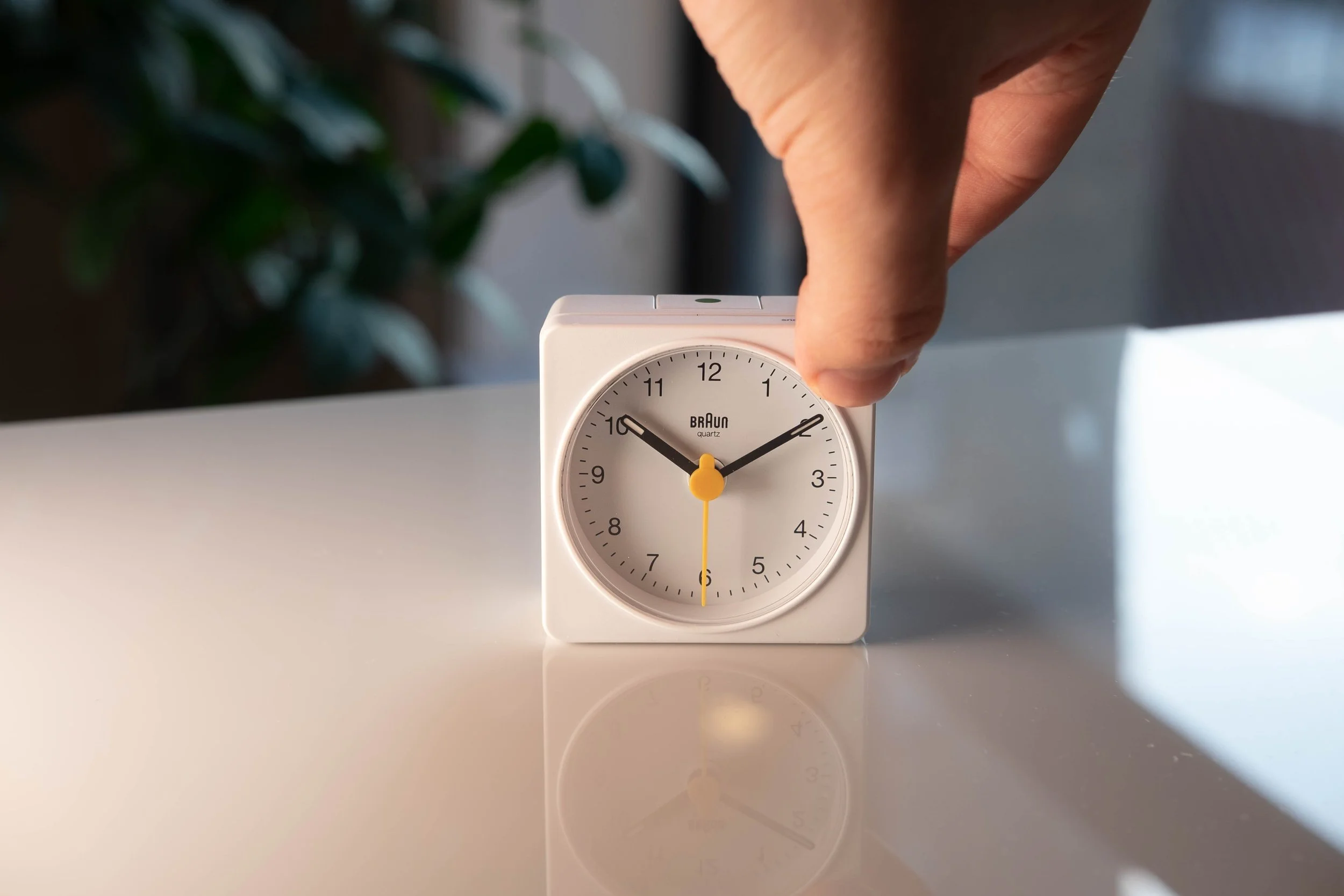
Speaking of the clock itself. The front face is classic Braun, instantly identifiable, and incredibly readable - once again, a triumph of visual hierarchy. Your attention is immediately grabbed by the dial, which, perfectly recessed into the body, tells you everything you need to know. Nothing more, nothing less.

There's no gratuitous use of color, nor is the Braun logo front and center like in so many other products today. The simple uses of contrast and a slight splash of yellow on the second hand are delightfully understated and incredibly honest.
Function
Operationally, the Travel Alarm Clock is incredibly straightforward, just a basic quartz movement, with alarm and clock-setting functions at the rear.

Despite its simplicity, though, this is one area where technology has spoiled us. A week in, I still need to get used to the old style of setting the alarm. The rear dials, though well-explained, remain confusing and at times infuriating to use, I'm sure that with time I'd get used to it, but, I'd still hope for a slightly more intuitive experience.
Not remotely infuriating, though, is the alarm on/off selector. It pops in and out of the top body with delightful satisfaction, and the small green dot delineating its function is once again a tremendous use of color.

When up, in its on position, that same green color is visible on the front of the now-revealed switch, with a corresponding hand on the clock face also sporting a slight splash of that same green.
Similarly charming is the night-lite function, which the push of a button on the top right can activate. It's noted with faint grey text: "snooze/light," and although it's nothing special, pressing that button casts a warm glow on the dial - just bright enough to read at night without irritating your eyes.
Initially, it seemed surprising to me that Braun opted for a non-uniform light source to illuminate the dial. But having spent some time with the clock on my desk, I have to say that the slightly off-canter lamp makes for a charming effect. Though technically inferior, the almost sun-like glow adds dimensionality to the dial, especially at night, making it appear quite friendly and inviting.
But there's no denying the Travel Alarm Clock is fundamentally an outdated product; there's nothing it does that my phone can't. But its charm lies in that technical irrelevance, and In a world of increasingly complex and convoluted design, it serves almost as a pallet cleaner. One that's unobtrusive, functional, and incredibly pleasant to live with.
Continue Reading